

inCase Express
Branding for Legal Tech Product Launch
inCase is an award-winning software company revolutionising how law firms interact with clients. Built by legal professionals for legal professionals, their mobile and desktop platforms are designed to streamline communication and improve client satisfaction across the legal industry.


They launched inCase Express as a faster, simplified version of their core product. I was brought in to create a full brand identity from the ground up, with a tight turnaround and a clear goal: make it feel connected to the parent brand, but distinct enough to stand on its own.
A Fast-Moving Brief for a
Fast-Moving Product
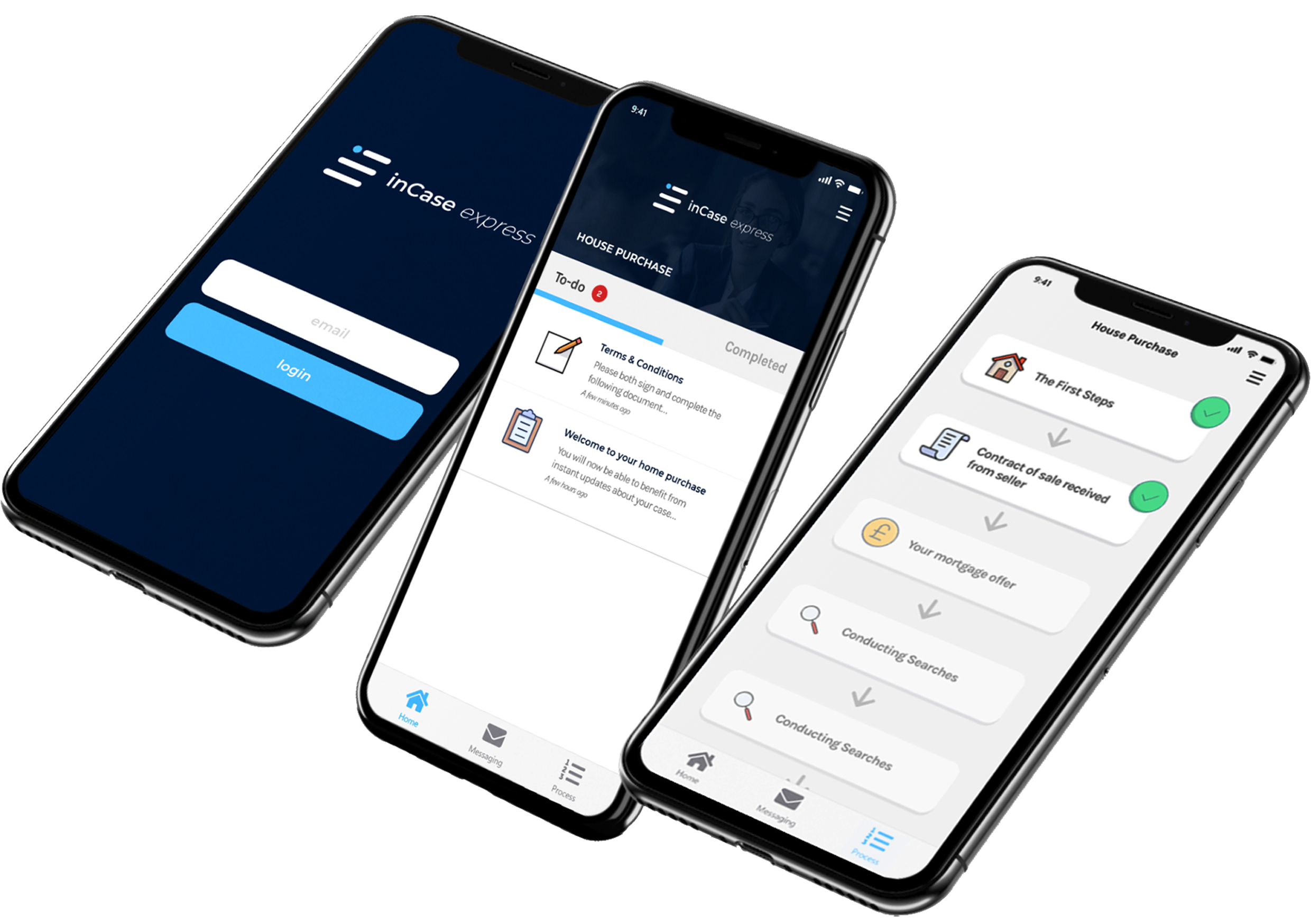
With just a week to deliver everything, I worked closely with the inCase team to shape the entire visual identity and rollout materials for inCase Express. This included:
Full brand identity including logo and mark
Brand colour palette, typography and visual language
Messaging tone and value proposition
Streamlined app UI concept visuals
Launch landing page design
Social media graphics and announcement templates
Sales support decks and pitch materials
Event assets and email campaign creative
Designing a Visual Link Between Speed & Trust
The visual challenge was to create something that linked back to the original inCase brand, but with a modern feel. I reworked the ‘i’ from the main logo and used it as the foundation for a new abstract symbol, placing it on its side and combining it with two angled lines to form a stylised ‘e’ for “Express”. The subtle tilt in the shapes helped convey movement and speed key attributes of the new product while still linking the structure of the parent brand.
This abstract ‘e’ became the centrepiece of the new identity, with the wider visual system leaning into clean lines, whitespace, and a colour system that suggests clarity and efficiency.
Designed to Convert…and It Did
inCase Express was positioned as a “taster” product, a low-commitment way to bring cautious law firms into the ecosystem before upselling them to the full platform. The brand had to feel credible and professional, but also more accessible and nimble than the full version.
The result was a confident sub-brand that helped inCase reach a new tier of clients, those who previously hesitated to commit fully. From sales decks to the app concept visuals, the design helped convey value at speed.